The Power of Colour in Office Design
Imagine working in a bland space, totally absent of colour. Everything, from the walls to the furniture, is all one shade of grey. Sounds awful, right?
Our natural human nature is to be attracted to colours, because of the various ways they make us feel. So it stands to reason that we can then be actively influenced by those colours.
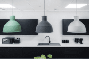
Where could a little colour be introduced in your office? A little strategy can go a long way, like the subtle touches of appropriate colour in the Harworth Group’s office break out space in Leeds.
With a bit of insider know-how, clever use of colour in the workplace can boost productivity, health and even overall happiness. Tapping into colour psychology positively impacts mood across the board, meaning adding in an injection of colour can motivate your workforce, increase job satisfaction and inspire healthy minds and bodies.
So, what does this mean for your office refurbishment or fit-out?
We’ve pulled together some of our keynotes on The Power of Colour in Office Design so you can get up to speed, and then crack out the colour!
Firstly, what exactly do we mean when we say Colour Psychology?
Colour Psychology is a pretty significant aspect of modern interior design – including for the office. In short, it’s the study behind (and guidance for) creating a space that reflects your business and your values, and creates a positive and inspiring environment for your team.
All without you having to say a word – just with the power of the colours you’ve chosen to use. For example…
Blue
Blue is generally known for its soothing properties, evoking tranquil thoughts and relaxation. A blue-themed office interior can actually lower your heart rate, blood pressure and respiration over time.
Blue is also often associated with authority, but often considered a non-threatening colour that instils confidence, making it great for use in branding and logo design to represent your business.
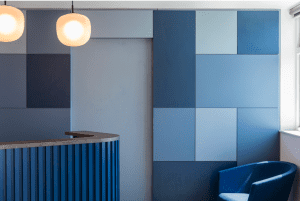
You feel like you’re in the right place as soon as you enter the AAK reception area. The reassuring blue is on-brand and immediately puts their visitors at ease.
As a colour linked to productivity, blue is also ideal for meeting spaces or boardrooms as it can promote creative thinking and problem-solving. There are no real negative effects of the colour blue, other than it can be a little chilly used on its own!
Green
If you’re looking for a truly positive colour that helps to stimulate thinking, boosts creativity and also helps to reduce anxiety and stress, look no further than green!
The harmonising effect green has on us extends to helping to prevent eye fatigue, helping your team feel calm and having an uplifting effect on mental health. Green helps evoke memories of summertime, fun, growth, nature and health.
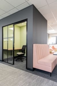
The little private working rooms have been given the green treatment in the Firmenich offices, helping to set these spaces apart from the rest of the office.
Speaking of nature, you might find it easier to add a little green to your office with a bit of plant life. Biophilic design is something we’ve discussed the major benefits of before in our Plants = Productivity post (because spoiler: they really do!).
Yellow and orange
This bright duo offers positive vibes aplenty!
The colour of teamwork, yellow and orange are best used in the most creative of environments to help stimulate mental activity. As more and more companies recognise the importance of hybrid working and adapt to a changing world, the need for collaborative spaces is prevalent.
These tones are perfect for innovation, social, agile and collaborative areas. You might have spotted that yellow and orange are fairly commonly found in fast food branding to increase anxiety and appetite, so in an office, they could be best used as an accent colour.
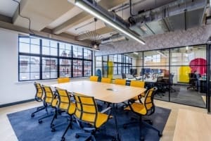
The bright pop of yellow in the Circus PPC meeting rooms helps keep everyone stimulated, aiding the generation of new ideas.
Red
Red is a lovely warm colour, often used in an area where there may be increased physical activity. It’s one of the most powerful colours but usually best used sparingly, perhaps in furniture or as a feature colour.
In fact, too much red can have a detrimental effect on your health, causing headaches, increased blood pressure and respiration.
Pink is a much softer way to get those warm tones in, providing comforting and cosy vibes aplenty and making people feel at home and valued.
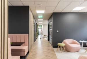
The warm pinks in the Firmenich workspace feels welcoming and cosy, making it the perfect hue to warm up the grey and, accented with green and wood tones, is still modern and appropriate.
Purple
Purple is a lovely one, not often used in office design, representing loyalty, royalty and ambition. You may have noticed it’s seen to create a feeling of luxury, and it’s versatile enough to contrast well with the other colours so you can use as much or as little as you’re comfortable with.
Not often seen in the workplace, purple is frequently used in nightlife and bar interior decor, or in the wellness industry, due to its links with calmness, luxury and spirituality.
Three simple ways you could introduce colour to your office space
Accent colours
A dash of colour can go a long way. Using accent colours can prevent a space from being too cold or too warm while adding a lot in terms of interest. Break up a large area with the introduction of a new hue, and enable yourself to keep the space interesting and fresh by updating the accent colour against a neutral background, rather than redecorating a whole space every year.

The touches of blue and terracotta in the training space we worked on for KCOM add some interest to the space but they’re grounding tones, rather than distracting bright colours.
Brand optimisation
Make the most of colour by using your brand tones to strengthen your brand presence, making it clear that you have a strong brand and identity does wonders for trust and loyalty.
This is especially important in the reception area where your workplace design will be working hard for you, making or breaking the first impressions. This area, where guests and potential clients or employees arrive, can ensure that the brand is instantly recognisable and that it evokes the desired emotional response.
Colourful art
Injecting colour into your office with art is a great idea. It brings a new feel to the space and can really transform an area, making it a great feature. This could also be said for a feature wall or a biophilic living wall, both great ways to introduce colours in a simple but effective way.
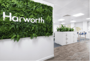
The greenery in this biophilic design helped break up the bright white in the recently completed Harworth Group offices and helped to bring a touch of the outside in.
So, if you’re looking to curate an office environment that has been cleverly optimised to maximise your employees’ productivity and well-being (and which company wouldn’t want that?) the use of colours that influence our emotions in positive ways could be the key.
To get the most out of your employees, you’d be wise to consider the space they’ll spend all of their time in very carefully.
If you’d like a little help with an injection of purpose-driven colour application in your office, give us a call and let’s see how we can work together.
