Office Signage Benefits for Staff and Visitors - How to make office signage NOT look boring!
The role of signage in an office fit-out might not be something you’ve considered as a top priority, but we’re here today to give you a little lesson in workplace signage, the importance of graphics, and chat about how to jazz the concept up a bit! Why be boring when you can be bold?

Big, bold and beautiful in the Envirovent break room, as this large wall mural signage clearly outlines.
Now, that doesn’t mean go crazy. In fact, when it comes to office signs, less is generally more. Whether you run a graphic design company or manufacture home appliances, signs should be simple, clear, and easy to understand at a glance. You don’t need 100 different signs in conflicting fonts and formats to confuse matters. But there are so many design, size, and layout choices, how do you make sure your office signs look professional and work effectively?

Big and bold, full wall-size decals letting everyone know that this is the Boardroom in the LeoVegas Newcastle office!
First impressions
Signage is important throughout the office but most especially in the reception or welcome space. This will be where people land, and as we know – first impressions count, but this is also where the most newcomers will be. Use the signage to support the first impression your business makes on customers and visitors, and to build confidence and trust. These people will be unfamiliar with your space and will need a little directing, more than any of the regular visitors and employees. But remember to be bold, be consistent and be smart with it.
Be transparent
The whole purpose of signs is to speed up the journey through the office to improve efficiency, cutting down on time spent being lost looking for the loos and making people feel more relaxed and taken care of. Modern offices often feature a lot of glass, to help share the light throughout the space, but it can still create a confusing warren for visitors to navigate. Why not utilise the glass and apply vinyl decals to this glass. It’s a cost-effective, speedy and easy to install way of adding signage, and it has the added benefit of being easily changed on a regular basis.

These icons in the KCOM meeting room proudly display the various uses for the room within, but without losing any light thanks to the frosted glass wall.
Avoid clutter
The key to effective and professional signage is clarity and simplicity. It should be able to communicate your message in an instant and from a distance, whether it’s your business name, a label or a wayfinding sign. Empty or ‘white’ space is important to give the eye a chance to digest the message easily. As a rough guide, around 30 to 40 per cent should be white or empty space.
Type of type
In a similar vein as the above point, choose a nice, clear and basic font over anything curly or swirly or handwritten. Your people will thank you for it. No one wants to have to struggle to decipher a sign. You might think unique fonts will suit your brand better but they can be difficult to read and people will ignore the important information.
Instead, pick a clean font and then play with the varying weights (regular, bold, etc.) to emphasise the most important information on the sign. It’s also worth remembering that using ALL CAPS actually makes things harder to read from a distance.

Simple, black on white, sans-serif brand font for West Barn Co. in their County Durham-based offices, lab and clinic, with each area as clearly marked as the last.
A splash of colour
Involve vibrant colours in your design! There’s no reason that you have to be boring or bland to be professional! Great interior signage in a bright hue or two will draw the eye (if used wisely) and make it easier for people to recall and remember your brand.
When choosing the background and font colours for your signs, think about contrast. You want the message to stand out!

The pop of bright green certainly draws the eye for the visitors of the Firmenich workplace in Thirsk, setting the tone for the company within.
Be consistent
Having fancy, custom signs professionally made will ensure that they will be recognizable and consistent with the rest of your brand identity, and with the rest of the interior design and any other signs you use. Plus, if your business has more than one location, the signs can be used to create cohesion offering visitors a consistent experience in each branch or location.

The brand blue and simple font speak volumes for AAK and their company ethos here.
Adding images and graphics
Consider replacing text with a recognizable icon! If your sign has a lot of text, adding a border around it may actually increase reading speed for users, while logos or artwork can boost the impact of the sign message and enhance the design.
If you’re creating a branded sign featuring the business name or logo, make sure the graphic is simple and clear. Use high quality vectors for print and, referring back to the points above, keep it simple! This often means using a simplified version of your logo so it reads better on a larger scale or from a distance. It’s always good to have a simplified logo in your back pocket for these sorts of occasions!

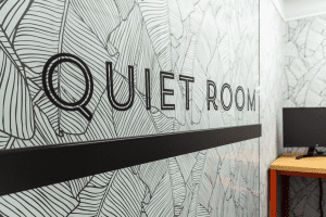
This snazzy number in the Circus offices lets staff know this is the quiet room with a simple high contrast graphic, but very much in-keeping with the brand look and feel.
Light up the office
Why not kill two birds with one stone and incorporate lighting into your signage? It serves two positive purposes; firstly, that your signings will be easier to read if it’s all lit up! And secondly, then the signage lighting will add to the overall ambience and brighter vibe of the workplace – and as we should all know by now, Light = productivity!
You could also use clever lighting as a way to offer guidance, even without written signs. Strategic lighting can effectively zone areas, highlight paths and create different feel for a meeting room vs a kitchen area vs a head-down work area, for example, making a real statement.

You know where you are in the Babble break room, as this jazzy sign introduces the Babble Cafe in all its neon glory!
Need some help ‘finding your way’ with office signage? We’ve got you!
We can help you get professional office signs that have been designed just for your space. That investment in the little touches tells those entering your space that you care, right down to the Nth degree, that you make smart decisions to elevate your business and that you are professional and capable in your field.
Ensure that you’re sending the right message by giving us a call today to benefit from our knowledge and experience in overall workplace design and flow. Let’s see what we can create for your business together.
